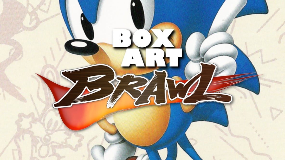
Welcome to Box Art Brawl, the weekly battle between box art variants to find out which lucky region got the best artwork with their retro games. Ready for a change of pace this week? That's right, we're getting an attitude, sticking it to the man and throwing out the rule book that's governed the previous thirty-one brawls. Yes, we're opening Box Art Brawl up to retro games that didn't originally launch on Nintendo systems. More on that in a moment.
But let's not get ahead of ourselves! First a recap of last week's bout between three groups of Ghosts 'n Goblins across NES and Famicom. Japan managed to mop up 20% of the vote while Europe bagged 32%, but North America was the clear winner. It's probably down to the plural spectres in its title compared to the singular European Ghost 'n Goblins. Congratulations to NA, commiserations to the rest.
So then! As you can see, our inaugural non-Nintendo entry brings Mario's erstwhile platforming rival to the brawl. With the hedgehog currently cleaning up in cinemas around the globe and with Sonic the Hedgehog 2 getting re-released on Switch, he seemed like the perfect choice to take us into the next phase of the series.
Don't worry, we're not going all SEGA Life on you! Our new rule is that eligible games must have appeared on a Nintendo platform at some point. So, 1991's Sonic the Hedgehog is safe territory seeing as Sonic's 16-bit debut has graced virtually every known platform since the millennium. 2006's Sonic the Hedgehog, on the other hand, would not be valid. In any way, ever.
Enough talk. Gotta go fast, and all that.
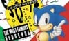
Japan
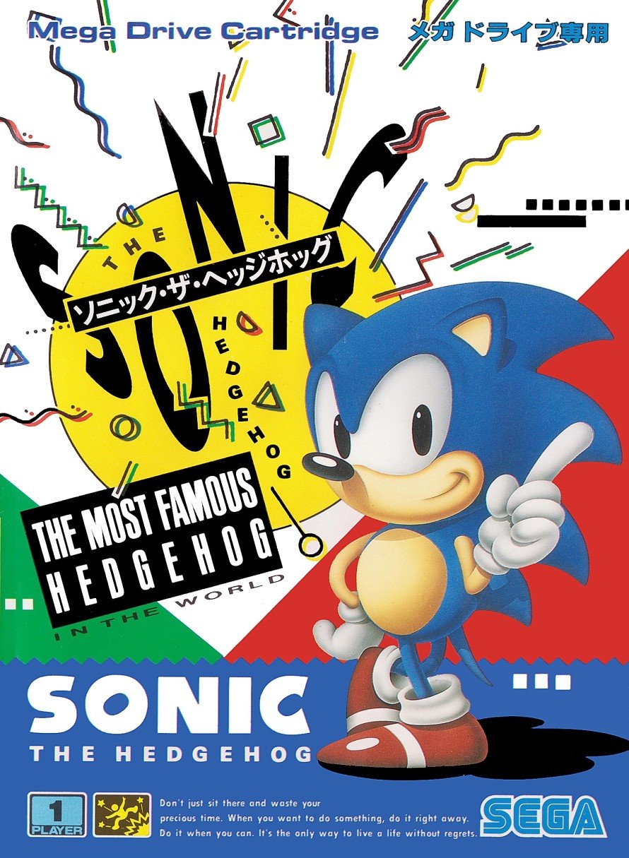
Before we begin, let's take a moment to digest these words of wisdom:
Don't just sit there and waste your precious time. When you want to do something, do it right away. Do it when you can. It's the only way to live a life without regrets.
Words to live by indeed, and it wasn't until looking closely at the front cover of Japanese Sonic 1 that we realised the small print at the bottom wasn't legalese or technical info. Nope, it's a philosophy that focuses less on going fast and more on seizing the day; not letting opportunities slip through your fingers. It's a shame the cute little guy was forced to switch gears and turn bratty, but we've always preferred silent Sonic. Suppose we're what you might call... wait for it... Sonic Boom-ers.
Eh?! EH?! Thanks very much, we're here all week - don't forget to tip your waitress.
Ahem. Back to the cover, it may have been cheeky for SEGA to claim he was 'THE MOST FAMOUS HEDGEHOG IN THE WORLD', but even before his popularity hit the stratosphere, we weren't exactly overrun with other well-known 'hogs. As for the rest of the cover, it's colourful, '90s and charming. It arguably lacks focus, but it's hard to divorce nostalgia and familiarity from iconic covers like this. It's Sonic!
North America
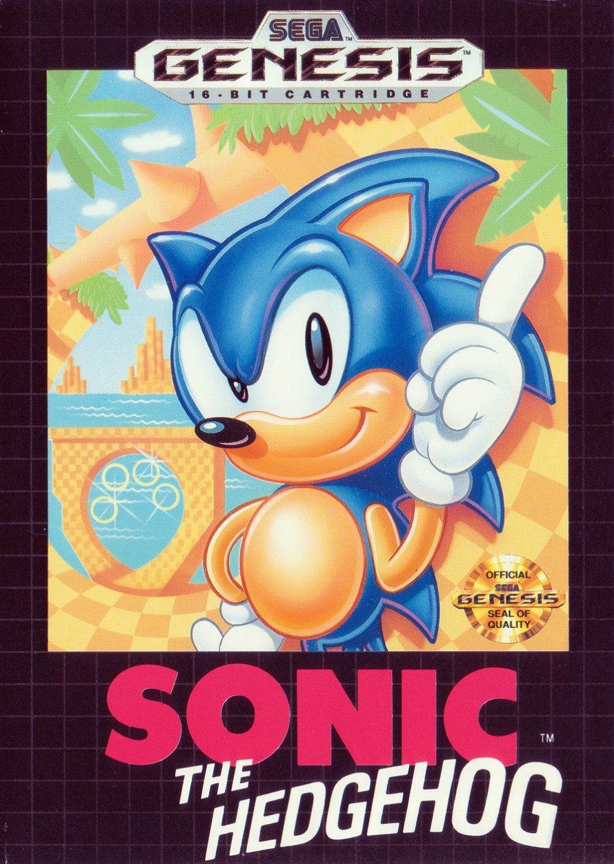
Ah, here we see where the rebellious personality started to develop. While proportionally he's still very much the recognisable blue hedgehog from the Japanese cover, the North American version for the Genesis adds more 'tude' with his raised eyebrow and slightly tapered ear tips. His entire body is more aggressively shaded and he's got a glint in his eye. Gone is the odd inspirational message, replaced with a simple logo and the shiny gold SEGA Seal of Quality.
Again, it's a classic and we love the faded art of Green Hill Zone in the background, although the black border has always felt a bit empty. Just us?
Europe
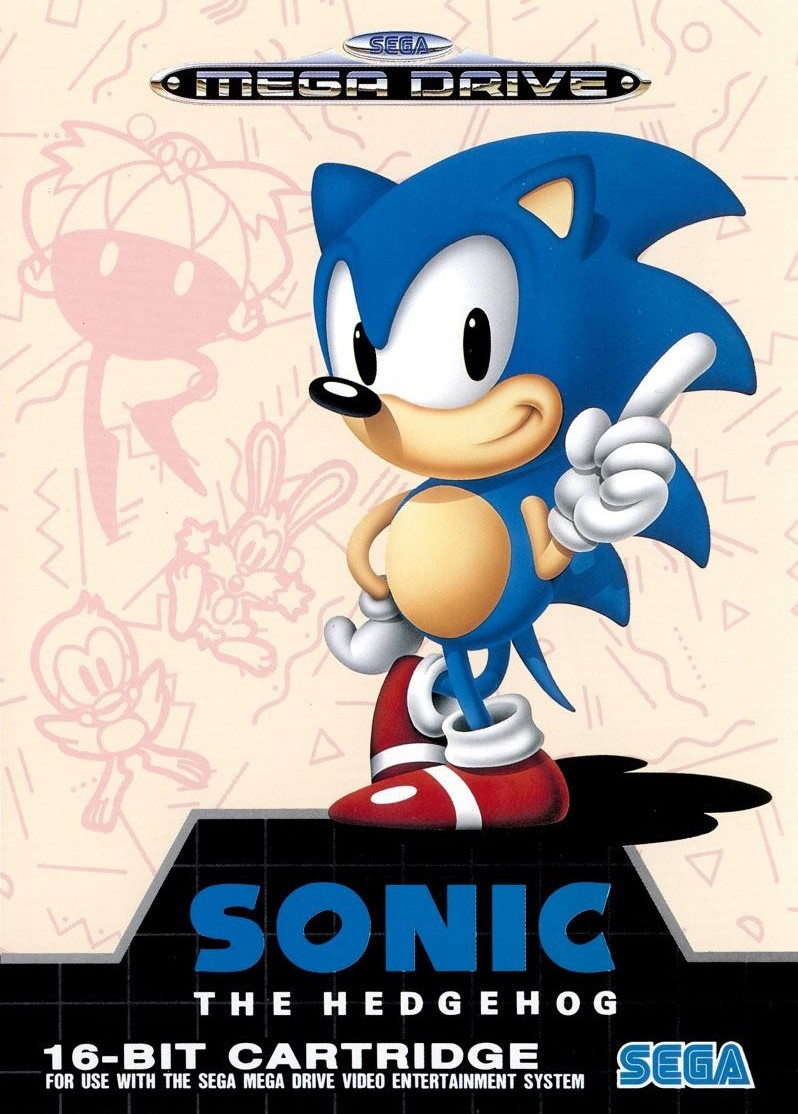
The European version is the one we played as kids, but even if we remove our nostalgia hats for a moment, we personally still think this one is best. The Japanese key art sits slightly off-centre with the background evoking the shapes and energy of the Japanese version, but it also throws in a couple of Sonic's animal buddies fleeing from Robotnik on the left. It's subtle, though, and you could easily miss it just by glancing at the game on a store shelf. The star of the game is never in question, but the abstract shapes of the Japanese version is made more interesting here. There's a bit more context for the eye to explore, though it stops well short of trees and loops.
At the risk of irritating North American readers, the shiny PAL Mega Drive logo is so much sexier than the Genesis equivalent. It looks like it should adorn a beautiful car grille or something. Put it on the Out Run Ferrari in place of the prancing horse! The standard black-grey grid lines occupy the bottom of the box but don't overwhelm the main image up the sides like the North American variant.
It's tough! We're obviously biased, but the list of things we like about this one is simply longer than the others. It's not up to us, though, is it!
Three quite different yet equally iconic covers to pick from, then. Give your favourite one a click below and then hit the 'Vote' button to register your vote. You haven't got to go fast, although we encourage you not to waste your precious time. It's the only way to live a life without regrets, you know.


It's okay, you can slow down now. That's all for this week, but we'll be back for another Box Art Brawl; same time, same place.


Comments 59
I'm not SEGA fan but i voted the European box for that Sonic game. It looks more beautiful than USA version.
Fun fact: the European cover was also used in Canada! ♪( ´▽`)
I feel like NintendoLife ran this poll because Europe is regularly bashed by Japan and North America in the competition. SEGA seemed to bring their A game usually to the European market.
These are all actually great, but I went with NA because i like the clean retro grid in the back. Japan's just really pops which I love, and Europe's looks okay, but I don't love the weird angles at the bottom and the background art kinda seems out of place here.
To my mind, the Japanese cover looks a bit of a mess with all of those random squiggles everywhere! I love the Green Hill Zone background of the NA cover... but I prefer the "full" picture of Sonic on the Europe cover, so went for that. And the animals in the background are hella cute! 😆
Voting on the Japanese cover just for the life advice.
Mrs Tiggywinkle wants a word
@Darknyht It's actually started to even out now.
Awwww, not NA on this one? It's so iconic. It actually shows a bit of the game. Sonic also has a bit more 'tude, with his head cocked and his... eyebrows? down a bit.
Europe because that border border on US and Sonic looks less like himself. I prefer the background a little in the Genesis version, though.
I always liked the Japanese cover, my first introduction to the game was on my mate's Japanese Megadrive. I don't think I've ever been blown away by a game as much as I was that day with Sonic the Hedgehog.It was 30 years ago now and the fact I can still vividly remember it is proof of the the effect it had on me.
That said, as much as I like the Japanese cover, I voted for Europe as even without nostalgia, that's a beautiful cover.
I like all these, very of there age but I particularly liked Japan and Europe's.
The European Master System cover should have been thrown on for how bad it looks. It looks like someone went into debug mode and pasted rings everywhere. XD
https://vignette.wikia.nocookie.net/sonic/images/c/c8/Sonic-8-Bit-Master-System-Box-Art.png/revision/latest?cb=20151101131917
Also, the Japanese Game Gear version is notable, with all the enemies dotting the cover it almost looks like a Pokemon game.
https://now.estarland.com/images/products/hr/41222/4974365133078.jpg
The NA cover easily wins this one. That green hill zone in the background is visually pleasing, and personally I enjoy the black border with the master system request grid. I think the backgrounds of the other covers look a bit disjointed. Plus, the EU cover spelled “Genesis” wrong
Voted Europe. Probably biased but always a classic to me.
Not sure how anyone could vote for anything but the European one, its clean, simple, doesn't have huge black borders and the positioning of Sonic on the cover makes sense.
All of them are great.
Voted for NA because it actually shows game stuff. Unless Robotnik actually does the Riverdance in the game when you get all the Chaos Emeralds (which I've never done), I'm not sure why he is doing it on the European cover.
I actually think the Europe one is the worst of the lot (not that it's bad). It's too plain for such a vibrant colourful game. But I guess people are voting on the one they grew up with
@kayleedayo, Really? I had the game when I was a kid and it was the NA box
@DjinnFighter: I think some places may have sold the US version (or maybe there were two versions?), but do an image search for “Sonic 1 Genesis Canada” & you’ll see it! I actually own a copy myself. 🤓 It’s so surreal! It has the EU art with the Genesis logo at the top. (I also have the Canadian variant of Sonic 2 with the slightly different EU artwork! It says Genesis but has the yellow checkerboard pattern on the sides.)
Voted EU because I absolutely loathe the style of shading on the NA box art. There’s a rim of light around everything, even the stuff that shouldn’t have one. Sonic’s belly looks like a floating egg.
@kayleedayo, oh that's interesting!
Japanese cover has a messy look to it, but isn't too bad - cough - Persona 5 - cough
Europe is good
NA is best, Greg Martin's Sonic is my personal favourite depiction of the character.
Voted NA on this one. I really like the black border. Pretty much the only thing I like about about 2d Sonic is the cover art though.
I really like the European cover. But the black border, level imagery, and the 'swooshing' effect given to the word hedgehog in the NA cover just edges it into the winner's circle.
@Jayofmaya
Those are some great covers. The Master System one would've had my vote!
I loved the game but I always hated the box for this one. I don't know why, it just felt so lifeless compared to other games we owned (I grew up with the European cover). So I have to vote for NA this time round.
@kayleedayo I have a copy of Castle of Illusion which I wonder if it is a Canadian copy, or if someone just put mismatching parts together: a "Genesis" box with EU "Mega Drive" cart and manual (horizontal multi-language manual, rather than the usual US vertical manuals).
All 3 are pretty good to me. But I'll have to give it to NA, the background level is pretty great and the gold SEGA stamp.
I had to give my vote to the North American cover this week.
Definitely the North American version for me!
@KingMike: You do indeed have the mismatched variant! 🤓 This site has a great list & pictures of the known Canada variants (and known variants with mismatched Genesis & MD parts)!
https://connect.gocollect.com/discussion/157448/canadian-sega-genesis-a-collecting-guide-blog
I have to go with NA on this one. The glimpse of Green Hill Zone in the background plus that gold SEGA stamp is a classic.
I think Japan is too messy. I like the NA cover best, with the stage background which I think better depicts the game. The Euro cover is not bad either, but I do prefer the NA one more.
Europe, understated but also striking.
I have a soft spot for Westernized Sonic, but over the years I've come to love the original design more.
Rare that we have three great boxes to choose from!
I like them all. I gave a slight edge to Europe because Sonic looks cleaner, and you can see more of him; I also like the minimalist background.
I love coming here every week for the many competing "How can anyone pick something other than my choice?!" comments. Y'all are hilarious.
Clean black border contrasting with the beautiful greenery of Green Hill Zone? North America for the win.
NA for me, so iconic. I was never a SEGA kid growing up, but that cover is pretty unforgettable.
Never liked the Japanese versions
It's too busy and chaotic , no design just sanic and some random background artifacts.
I will admit nostalgia is playing a role here, but NA is the no-brainer vote for me. That art is absolutely iconic.
Huh. I don't often see EU covers I like, but this one's pretty good, and just beats out the NA for me this time. The Japanese one is very Japanese indeed - plenty of spirit, but way too messy for my tastes.
Let's be honest, Japan were very cocky with that MOST FAMOUS HEDGEHOG on the box. 😂
That Europe box hit me right in the nostalgia feels! Way too much going on the the Japan one.
America loves the angry eyes!
Box Art Brawls Current Total:
Europe: 10
Japan: 11
North America: 11
100% NA, kinda surprised to see the support of the Europe art, seems uninspired to me.
i love the fun colors of the japan one but the europe one just looks so CLean.
For a character that's known for running, you should be able to see his feet, right? NTL, NA's my hood, so I gotta pick Genesis.
I like both the North American and the European/Japanese box arts of Sonic the Hedgehog. Fun fact: the cover art for the North American cover of this game is made by the late Greg Martin.
The European version is always used as the 'classic' art in articles across the web and it's currently sitting about five feet from me. Loved it when I was 6, love it now I'm 27!
No, the European background art is much less interesting due to the lack of color! It ruins the whole thing compared to the excellent American background art!
Meanwhile, the Japanese background art is just too abstract. It doesn't tell you anything about the game at all!
@Morph Because the background art completely sucks in comparison, that's why! Both the EU and NA boxes are clean and position Sonic well, but the European art is way too simple. The NA black borders are easily forgivable in comparison. Whoever thought it was a good idea to paint the background in monochrome and put in a bunch of lazy scribbles was an absolute idiot!
North America. For me, one of the most iconic boxes of any game.
That Japanese cover just screams '1990s'. It's the multi-coloured scribbles and shapes on a white background, and the 'zany' way that the SONIC letters are flying all over the place. You see those scribbles everywhere these days thanks to the current obsession with 90s nostalgia in fashion and design.
I like the Green Hill Zone of the NA cover, but I can't stand how Sonic was redrawn. He looks cocky and almost evil with that grin! The proportions are also off: his smile isn't well placed in that hotdog-shape, making it look like he had his wisdom tooth pulled. And his belly is too big and sticking out. Oh yeah, he's American, makes sense
I have a soft spot for the EU Mega Drive version. I also prefer that design of sonic (which appears to be the original Japanese design) over the US ‘mohawk’ design. The Japanese one seems a like a celebration poster more than a cover imo.
Europe.
(Great game)
Tap here to load 59 comments
Leave A Comment
Hold on there, you need to login to post a comment...